 Home
Home
Design Patterns
Dashboard Genres
Design Tradoffs
Process & Guidelines
Workshop
Paper & Material

Design Patterns
 » Download Pattern Cheatsheet (compact version)
» Download Pattern Cheatsheet (slim version)
Jump to…
- Data Information
- Structure
- Visual Representation
- Page Layout
- Screenspace
- Interactivity
- Meta Information
- Color
1. Component Design Patterns
The components of a dashboard are the crucial visual elements of a dashboard, relating to the data and its presentation. We identified four groups of design patterns: data information, meta information, the visual encoding of the data, and the high level interactions supported by the dashboard. We disregard any visual components that purely serve as decoration or embellishment, e.g., illustrative pictures, dividers, borders, etc.
Data Information
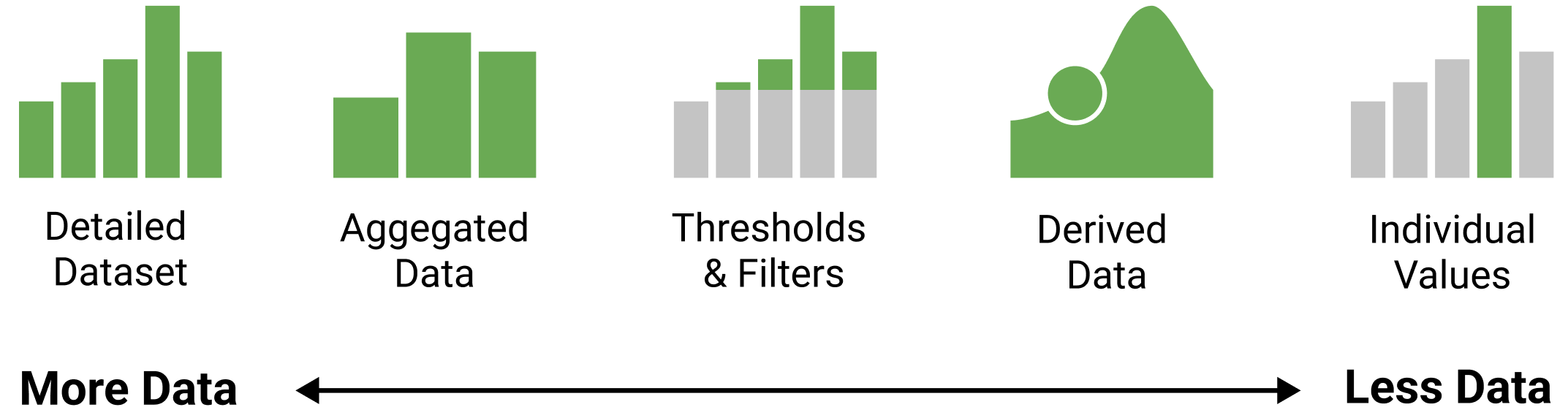
This group captures the type of information shown in a dashboard. We found that information in dashboards ranges from the presentation of raw data to several levels of abstractions which simplify and reduce the amount of information shown. In other words, given a data set with multiple data elements (e.g., rows in a data table) and attributes (columns), dashboards can provide many different abstractions of this data set.
 Individual values are specific data points in a data set, e.g., the most recent value in a time series. Showing an individual value (compared to the entire or a filtered data set) implies the importance of the single, e.g., most recent, or highest, value in a given context.
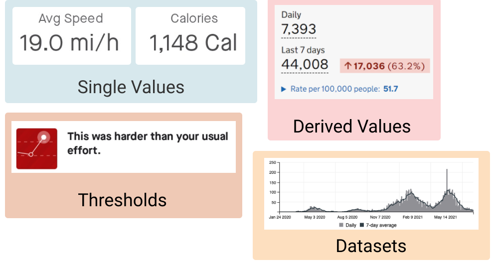
 Derived values include information derived from datasets or other values (e.g., trends). These provide a degree of abstraction over a data set, since they imply a specific interest in these derived values rather than the raw data. For example, derived values can be Key Performance Indicators in a given context. In many cases, derived values have been calculated independently from the dashboard (e.g., incidence values per fixed population).
Filtered shows a subset of the original (detailed) data, e.g., the last 14 days or any other simple rule to show a subset of the data available.
 Thresholds make an explicit judgment about a data point, e.g., indicating whether a situation is good, bad, or neutral, according to objective thresholds for subjective labels. Thresholds are one of the highest levels of abstraction found in dashboards, as thresholds can have specific semantic meaning and implications.
 Aggregated data are the result of bringing together numerous data points into a new and more concise data point. For example, data values from the individual regions of a country may be aggregated into a sum or mean value about the country as a whole. Aggregation often implies the presence of multiple related data values, which may be of particular interest to a dashboard user.
 Detailed datasets offer a more complete presentation of data. This can include multiple data elements and attributes, time series, and detailed geographic information which all show raw data. In the case of time series, a dataset is often filtered to a time range of relevance, e.g., the last 14 days. Showing raw data implies lots of details but little “judgement” about which characteristics of this data set are important. Datasets are shown to provide an overview, support comparison of multiple data sets, and to encourage individual exploration and analysis.
Data Information Examples
Examples of Data Information in dashboards.
Meta Information
This group captures additional information to provide context and explanation about the data. Sometimes this information is implicitly understood from the context the dashboard is used in, e.g., the current date can imply when data was last updated, or data released by a specific organization can indicate the source of the raw data.
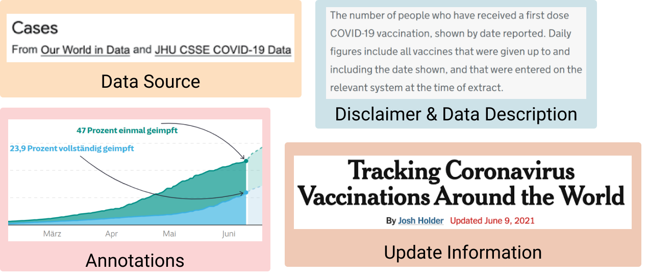
 Data source: identifies where data comes from, potentially including links and explanations about how data were collected and analyzed, and which tools were used. May also provide direct access to the data (e.g., in embedded tables).
 Disclaimer: indicates specific assumptions and decisions in data processing and visualization, or gives context for data and how it is presented. For example, the EU COVID-19 variant dashboard outlines limitations in the data and explains why data may be missing/misleading, and Google’s COVID-19 forecast for Japan explains where its predictions come from and what is/is not included in each statistic.
 Data description: gives a high-level description of the data to explain what the dashboard is showing.
 Update information: indicates when the data was last updated, typically specifying a date and/or time.
 Annotations: extra graphical embellishments added by the dashboard author to highlight specific points, changes, or developments in the data.
Meta Information Examples
Examples of Meta Information in dashboards.
Visual Representations
This group describes common solutions for presenting data information in dashboards.
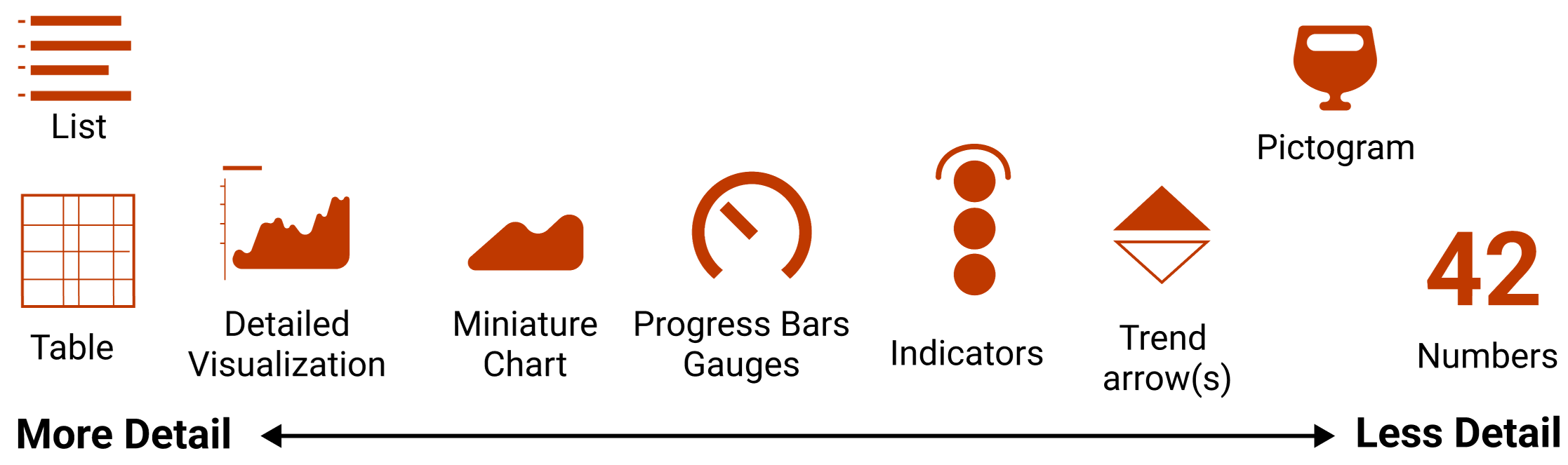
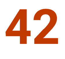 Numbers: individual numbers placed prominently on a dashboard, mostly used to indicate single key values. Numbers can represent absolute values, proportions (e.g., percentage or normalized per million) and have specific units. Numbers are usually large in text size, compared to, e.g., titles and descriptions, to draw attention to their value. They are sometimes colored to attract attention.
 Trend-arrows: small arrows pointing up or down, used to indicate the direction of change in a data value. Some trend arrows are binary (up/down/neutral), whilst others include more fine-grained slopes. Trend arrows are often red or green, depending on semantics (positive/negative). These are often shown alongside numbers or included in tables.
 Pictograms: abstract representations or symbols that illustrate concepts in the data. Can be used to represent data (i.e., conveying specific data information), or to designate the type of a data value found near the pictogram (but not conveying specific data information).
 Gauges and progress bar: any sort of visualization used to represent a scale or range of a value. Specific solutions include semi-circular gauges, linear progress bars, thermometers, etc. Values represented by range-representations can refer to both values that only grow (e.g,. vaccination of population), as well as fluctuating values (e.g., COVID-19 cases per 1000 people). Some gauges come with an indication of ‘critical’ ranges, i.e,. a threshold indicating if values are positive/negative.
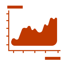
 Signature Charts: small and concise visualizations without axis descriptions, labels, or tickmarks. The idea is to give a quick understanding of a trend, akin to sparklines, rather than allowing the reading of precise values.
 Detailed Charts: detailed visualizations with sufficient details to read and understand precise values (e.g., axes, ticks, values, etc).
 Tables: these show raw data values in a tabular format. The most simple form of a table is a simple key-value list, but tables can show several columns and may include signature charts and/or trend-arrows. Tables do not need to contain numerical values, but can also include information through color/darkness (e.g., heatmaps).
 Text Lists: lists of textual information, e.g.,like tickers that show non-quantitative information.
Visual Encoding Examples
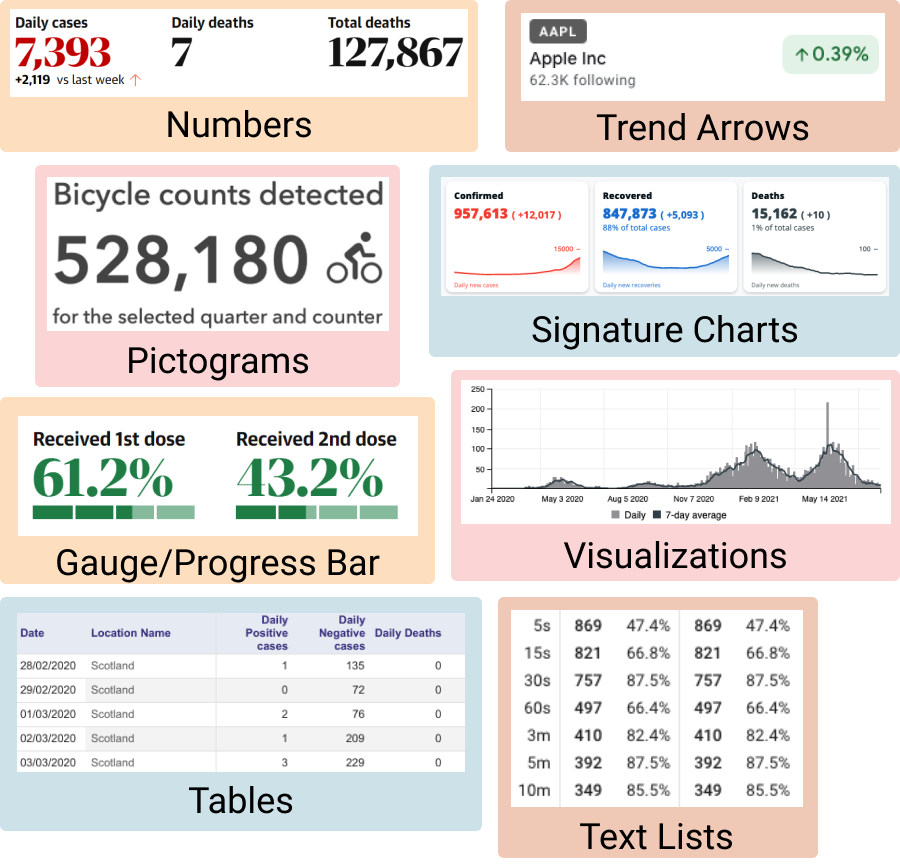
Examples of Visual Encoding in dashboards.
Interactions
This group describes common interaction approaches found within the dashboards. Interaction can exist through interactive data, user interface elements, and window-level interactions (e.g., scrolling). The patterns we highlight in this group refer to common roles that interaction could play in dashboard use, expressed through specific user interface components. These are defined broadly, to identify general usage patterns and how they can be implemented through dashboard designs.
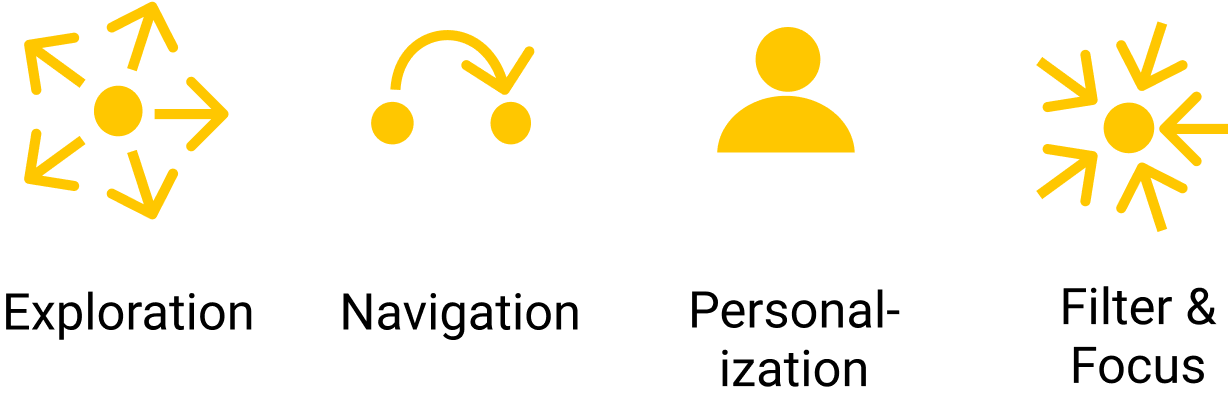
 Exploration interactions allow users to explore data elements and the relations between them. Exploration interactions can take on my forms, including brushing and linking interactions that link data representations across different views, and detail-on-demand interactions that provide additional information through pop-ups or tooltips.
 Navigation interactions enable designers to direct users through facets of information in a particular order. Interaction elements can be used to navigate between different dashboard components and layout structures (e.g., pages, tabs). Interaction techniques and elements such as scrolling, navigation buttons, or tab links can be used to create a journey for the viewers through which they explore the information. Navigation can be constrained and follow a particular sequence, or can be unconstrained to allow free navigation. Examples of navigation interactions include:
- Tabs that inform the user about available content and allows navigation between views.
- Links that support navigation through clickable visual elements (e.g., charts, titles, clickable text).
- Navigation buttons that allow users to move forwards or backwards through the pages of a dashboard in (or out of) sequence.
- Animated transitions that are used to advance through dashboard pages automatically, like a slide show.
 Personalization interactions allow users to redefine and reconfigure the information shown within a dashboard. For example, users may be able to add new representations (e.g., by choosing a new data feature to be visualized), resize dashboard elements, or reorder the existing dashboard elements. Such interactions may lead to more specialized and bespoke dashboard configurations, where the viewers are more actively engaged with the information content after the dashboard is designed and deployed.
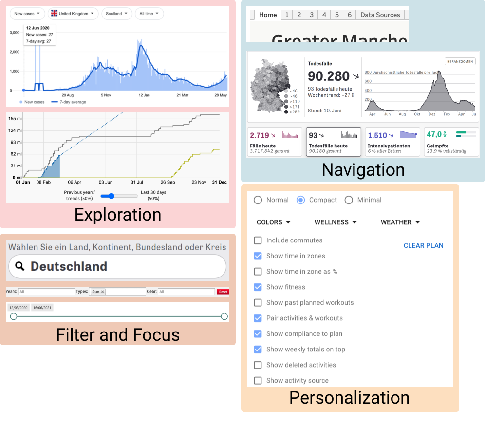
 Filter and Focus interactions allow users to find or focus on specific data, e.g., by searching for particular data values or applying filter criteria so that only relevant information remains. These interactions are typically facilitated by user interface elements like text fields, checkboxes, radio buttons, range sliders, etc.
Interaction Examples
Examples of Interactions in dashboards.
2. Composition Design Patterns
The composition of a dashboard determines how its individual components are combined on screen. Dashboards show multiple information elements and their structure and layout on page are meaningful decisions made by the designer. We identified several groups of composition pattern: the use of available screenspace to represent information (including strategies for reducing the amount of information shown at once), the structure of multiple dashboard pages and the relationships between those, the layout of components in a single dashboard page, and the use of color and color schemes throughout a dashboard.
Screenspace
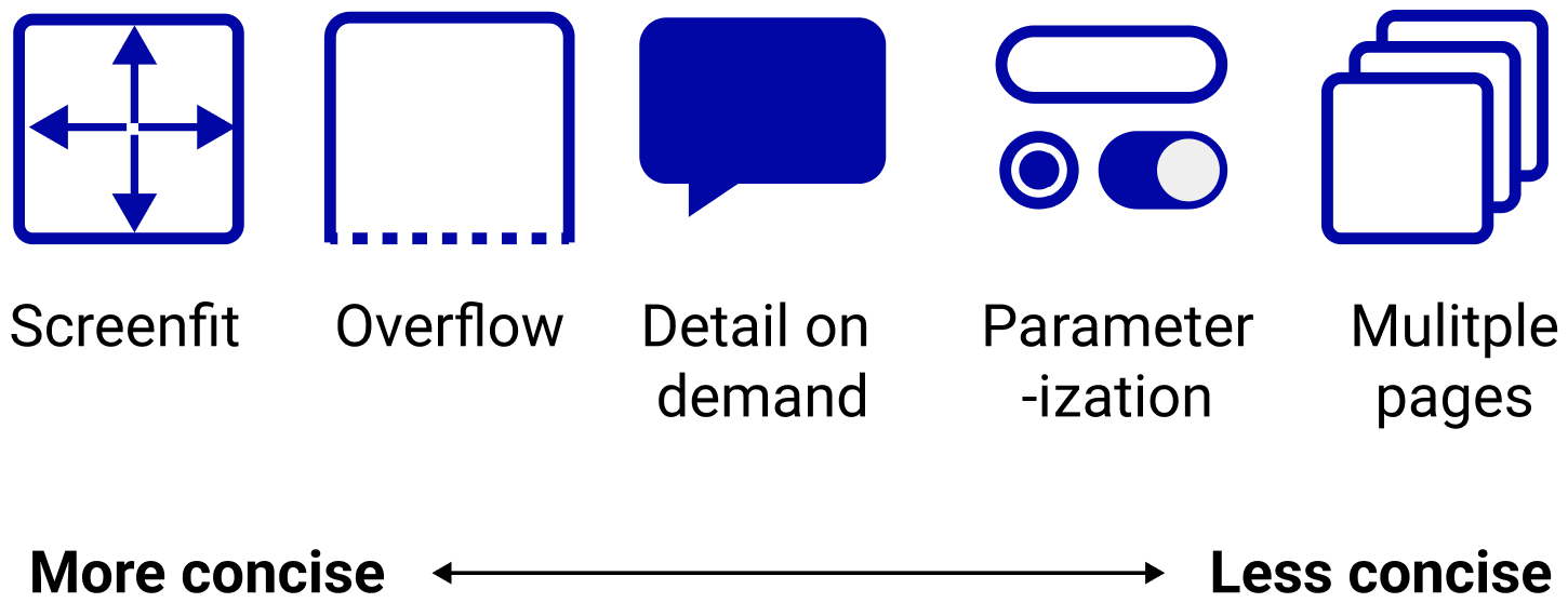
Dashboards can only show a certain amount of information on screen at a single time: available screen space is consumed by the amount of data information to be shown and the dimensions of their visual encodings. Whilst some dashboards can fit entirely on screen, it may be necessary to adopt display strategies that reduce the amount of information shown on screen at a given time. We identify a range of strategies for making use of available screen space, ranging from concise screenfit dashboards that fit entirely on screen, to less concise dashboards with multiple pages of information. These strategies are not mutually exclusive and can be combined, e.g., using detail-on-demand to make more economical use of screenspace in a screenfit dashboard.
 Screenfit dashboards are fully visible on screen and all information is visible at all times. No interaction is needed to view any of the dashboard content, as all information fits on screen and is available at a glance.
 Overflow designs allow a dashboard to exceed the available screen boundaries, so that additional content is rendered off-screen and is revealed as the user scrolls. This approach allows all dashboard views to be made available on a single page, even if not all are visible on screen at once.
 Detail-on-demand interactions allow dashboards to reduce the amount of information shown on screen at once, by revealing more details only when the user asks (for example, using tooltips or pop-ups).
 Parameterized dashboards allow users to control what content is currently shown on screen. We found several approaches for providing dashboard parameters, including checkboxes, drop-down menus, lists and search fields for filtering data, sliders and pickers for selecting date ranges, or radio buttons and switches for changing the data. These typically allow users to choose which data is shown through the dashboard widgets.
 Multiple page dashboards are composed of elements distributed across several pages, with one page shown on screen at a time; here, ‘page’ refers to a single composite view within a dashboard and does not necessarily mean, e.g., distinct web pages. There were many strategies for presenting an overview of available dashboard pages and allowing viewers to navigate between them, including tabs, navigation buttons and links.
Structure
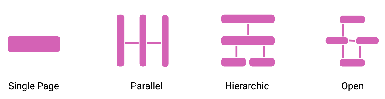
These page structure patterns describe how a dashboard organizes information across multiple pages, and the implied relationships between those pages. These patterns may influence how a user navigates through the various pages of a dashboard, and may also be influenced by the intended use of the dashboard (e.g., providing a hierarchical page structure so that users can ‘drill down’ into increasing levels of detail, or using a parallel page structure when users only need a high-level overview of small number of views).
 Single Page: a dashboard presents all information on one page, e.g., using screenfit or overflow to utilise available screenspace.
 Hierarchical: a dashboard has multiple pages organized in a hierarchy that implies a structured relationship between pages and the information they convey. Dashboard pages at adjacent levels of the hierarchy might, for example, differ in the amount of detail they show and support users in drilling down to greater levels of detail (e.g., abstract representations in a top-level page vs detailed representations in a low-level page). Dashboard pages from the same level of the hierarchy will typically be related in some way (e.g., a top-level page showing data from a whole country, with multiple lower-level pages showing data from the individual regions of that country).
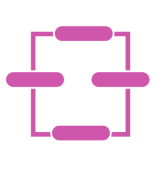
 Parallel: a dashboard has information distributed across multiple pages, all considered to be at the same ‘level’ with no hierarchical relationships between them. For example, each page might represent distinct facets of the data set. Navigation between pages is typically unconstrained via top-level navigation widgets like tabs or links.
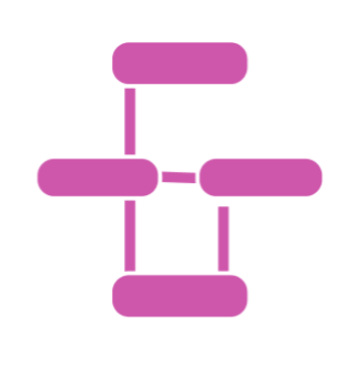 Open: a dashboard has multiple pages but with less rigid relationships between them. Contrast with a hierarchical or parallel dashboard structure, where there are more clearly defined relationships between pages and the data information they show.
 Semantic: a dashboard with multiple pages, whose relationships are determined by the semantics of the information being shown. For example, a dashboard for an organization may have pages relating to distinct divisions within the company, with pages following the operational structure of those divisions.
Page Layout
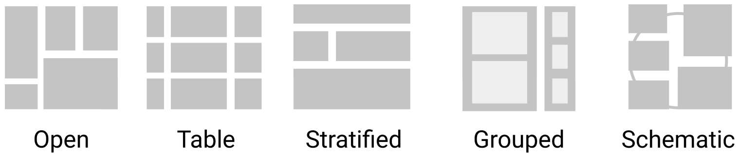
Layout patterns describe how the widgets are laid out and sometimes implicitly grouped together in a dashboard view - i.e., the prominent layout decision used to group a potentially large set of visual components. We emphasize that none of these layout patterns are exclusive and combinations can be used. Note: when describing layout patterns, we define a widget as the smallest unit on screen.
 Open Layouts: widgets of different sizes and aspect ratios are laid out in an open way without apparent specific rules. Often these widgets are aligned at a grid following classical design guidelines. There is no strong semantic associated with the location and adjacency of widgets and each widget seems to have equal importance. Widgets can be arranged closely if they are related (e.g., first and second COVID-19 vaccine dose) or they have similar visual types for aesthetics reason (e.g., top rows are all gauges and bottom rows are all line charts). Tiled layouts invite reordering and adjustment of widgets by the user.
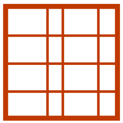
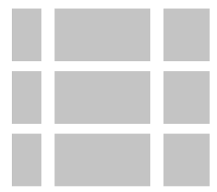 Table Layouts: these align widgets (or groups of widgets) into columns and rows, each with a specific semantic and inducing a repetition of information and visual encoding. Rows and columns can represent facets of the data set such as time, data elements, or any other grouping. Table layouts make it easy to retrieve and relate specific information in a multidimensional dataset. Usually, the visual content along a column uses the same visual encoding. Table layouts imply direct comparison and juxtaposition of information across widgets.
 Stratified Layouts: these emphasize a top-down ordering of widgets and their information. For example, dashboards may show general high-level information along the top, while showing more detailed information further down. A strata layout can be used to emphasize some information (e.g., further up) over other information (e.g., further down).
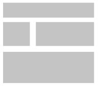
 Grouped Layouts: these visibly group two or more widgets with a specific relation. For example, using diving lines, whitespace borders, or shaded background regions to emphasize grouping of related widgets. A dashboard with clear explicit grouping may help viewers observe the data more easily, especially for intended public audience.
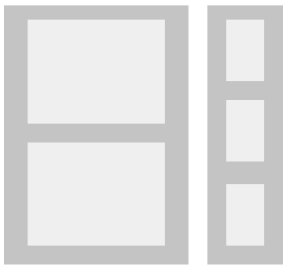
 Schematic Layouts: these place widgets in a dashboard informed by some external property such as a physical layout or other types of schematic relationships (e.g., widgets placed on a map to represent geographic location of data points). Such dashboards can leverage a user’s spatial/geographical/etc knowledge to support visual analytics tasks.
Layout Examples
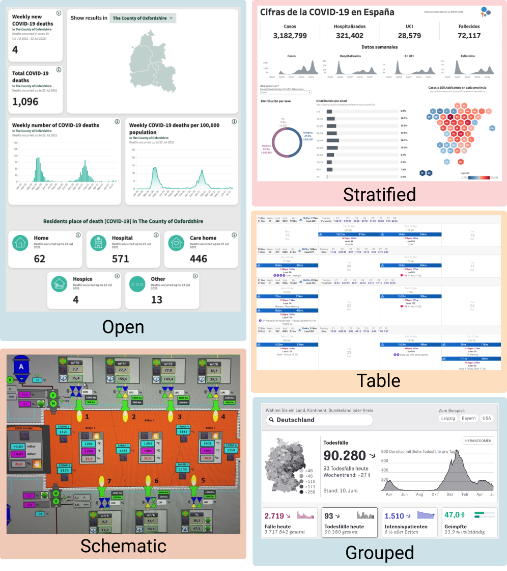
Examples of Layout in dashboards.
Color
Color is an important visual variable in visualization and can be used for different purposes in dashboard design as well.
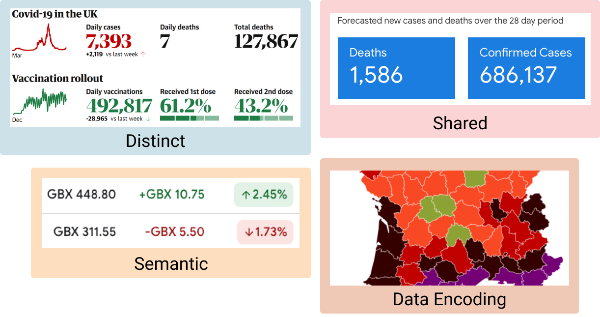
Distinct color schemes use unique colors (or colour palettes) for different widgets or data types.
Shared color schemes used a shared color palette across all dashboard components (e.g., re-using colours to conform with branding).
Data Encoding color schemes use colour to encode categories or scales within the data.
Semantic color schemes use color to indicate specific semantics about the data. This requires a mapping between data indicators and a real-life outcome with semantic connotations, e.g., traffic light schemes, green/red for positive/negative sentiment, etc.
Emotive color schemes can be a powerful means to add aesthetic strength and develop an emotive response in viewers.
Color Examples
Examples of Color in dashboards.