 Home
Home
Design Patterns
Dashboard Genres
Design Tradoffs
Process & Guidelines
Workshop
Paper & Material
1. Dashboard Types
Our analysis revealed several dashboard types, with shared characteristics, similar use of design patterns, and similar goals. These demonstrate common ways of putting design patterns into practice. These dashboard types be used in design exploration and can inform discussion about the ‘best’ dashboard design for a given context.
We see a distinction between curated dashboards and data collection dashboards:
- Curated dashboards:
- Highly selective of data and visual representations;
- Have a specific goal, e.g., to inform viewers about something in particular;
- Could be considered as author-driven storytelling [Segel and Heer]
- Data collection dashboards:
- Aim to transmit large volumes of information;
- Allow viewers to seek the information most relevant to their needs.
- Could be considered as reader-driven storytelling [Segel and Heer]
2. Curated Dashboards
2.1 Static Dashboards
Common design patterns:
 Flat structure
 Signature Charts
 Trend Arrows
 Numbers
 Open layout
By static dashboard, we refer to the traditional notion of a dashboard as a non-interactive and flat structured display of information. These are less common now than one might imagine, which we attribute to the fact that modern dashboards are digital and it is easy to support interaction and drill-down tasks through more complex structures. Another reason might be that the range of display sizes on desktop computers, tablets, and mobiles encourages adaptive solutions (e.g., use of overflow or paginated structures).
Static Dashboard Example
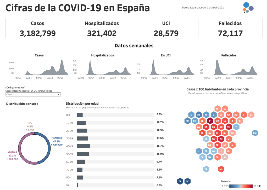
Example of a Static Dashboard.
2.2 Magazine Dashboards
Common design patterns:
 Visualizations
Annotations
 Tables
 Table/Grid layout
 Overflow page structure
Many dashboards relating to Covid-19, climate change, politics, etc, are typically created by news agencies and similar media outlets. These dashboards are found as integral part of journalistic articles and resemble visualizations of the magazine genre. The text goes beyond basic meta information to provide additional commentary and storytelling about the data. These dashboards are often broken into several pages and have an overflow page structure with linear layout, with visualizations positioned at appropriate points in the text to tell a story about what the data shows.
As an example, The Economist Covid-19 tracker (shown below) provides viewers with a snapshot of Covid-19 cases and deaths across Europe, with tables, timeseries, trend lines and spike maps interleaved with narrative text. In addition to regular visualization updates, written content is also frequently updated as the ‘story’ changes, e.g., responding to emerging trends, the effects of vaccination, etc. These dashboards naturally require more effort to design and maintain; whilst visualizations may update automatically as the data changes, editorial oversight is necessary to ensure the story remains consistent with the changing data and its visual representation.
Magazine Dashboard Example
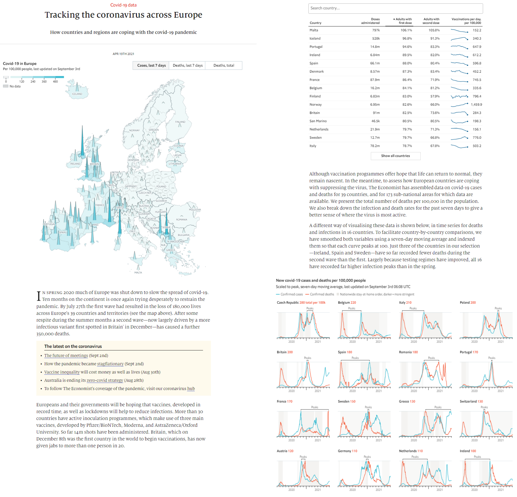
Example of a Magazine Dashboard; note this appears to viewers as one continuous page.
2.3 Infographic Dashboards
Common design patterns:
Annotations
 Pictograms
 Open layout
 Overflow page structure
Some dashboards have similar designs to infographics, including decorative graphical elements and other non-data ink shown alongside data representations. Similar to magazine dashboards, they use non-data media to annotate and embellish data. For example, the image below shows an infographic style dashboard that uses text, annotations and other embellishments to enhance data presentation and, in turn, help the data to convey a story.
Infographic dashboards are often used to represent static datasets; e.g., presenting snapshots of key data on a monthly or yearly basis. Often these infographics exceeded the vertical screen-space and could be explored through scrolling). The artistic content of infographic dashboards may require additional design time and chosen annotations and embellishments will be tailored to particular data points, so are less suited for dynamic dashboard use where data changes often. These dashboards may thus have a different intended use, with an audience expected to discover them over a longer period of time, rather than checking in frequently for updates.
Infographic Dashboard Example
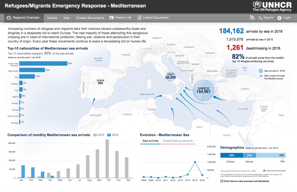
Example of an Infographic Dashboard.
2.4 Embedded Mini Dashboards
Common design patterns:
 Flat structure
 Parameterized page structure
Navigation interactions
Dashboards can be embedded into other applications such as news websites. These concise miniature dashboards only occupy a small area on screen and usually come with a range of interactive features for navigation, or to parameterize the content. The image below shows two pages from a mini Covid-19 dashboard embedded into a news website; like similar mini dashboards, it uses navigation interactions to allow movement between pages and is linked to a more in-depth narrative dashboard that invites further exploration beyond the initial data at-a-glance.
Embedded Mini Dashboard Example
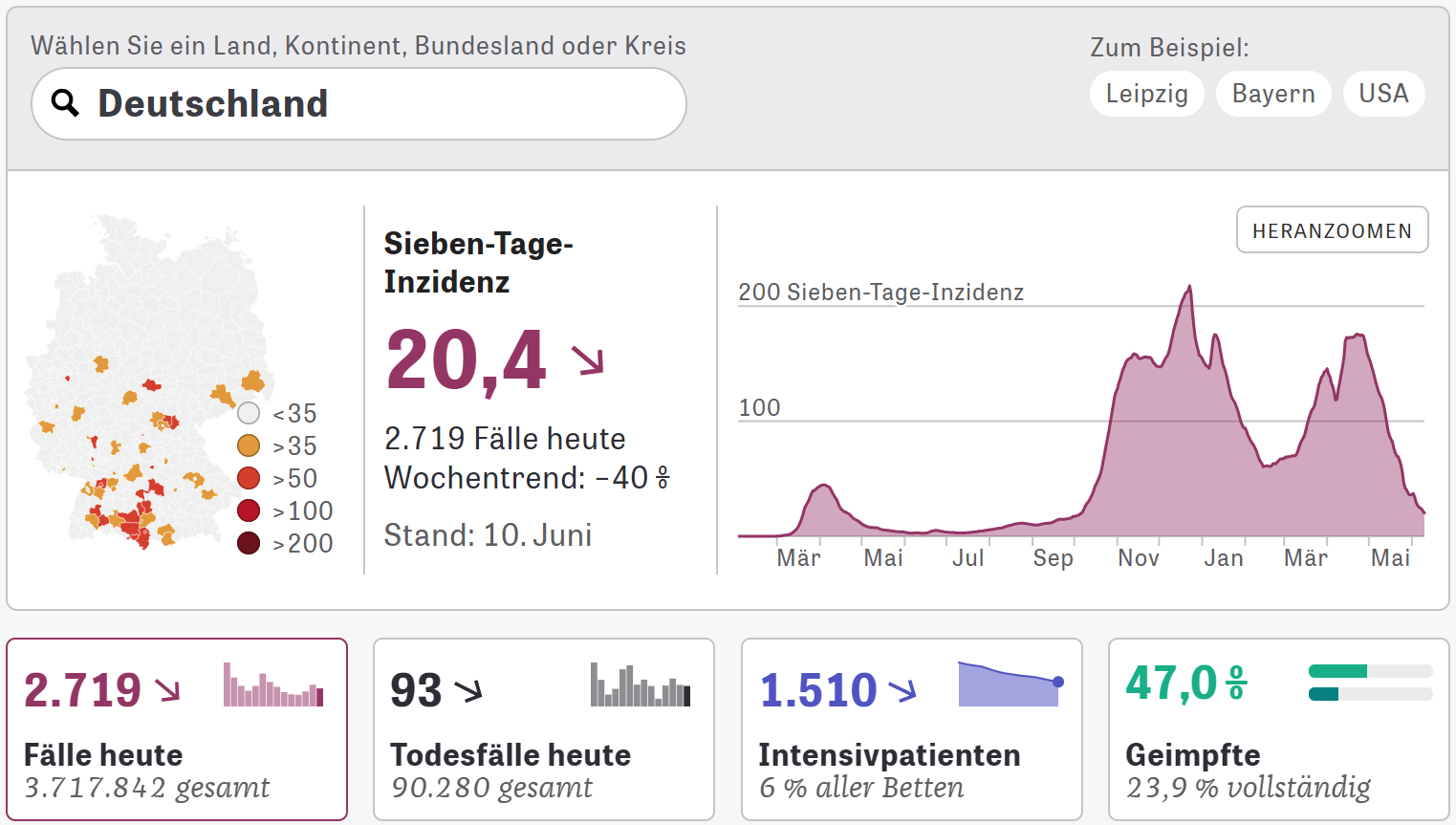
Example of a Mini Dashboard.
3. Data Collection Dashboards
3.1 Analytic Dashboards
Common design patterns:
 Visualizations
 Tables
Exploration interactions
Navigation interactions
Personalization interactions
 Parameterized page structure
 Tabbed page structure
 Linked page structure
 Animated page transitions
This dashboard type is what Stephen Few would call a Faceted Analytic Display. We see strong parallels to the concept of Multiple Coordinates Views. This type generally uses complete visualizations (rather than simpler signature charts and trend arrows). Many of the dashboard elements are fully interactive, providing for pan+zoom, focus+context, tooltips, brushing+linking and other exploration and navigation strategies. These dashboards can also provide parameterization, and use tabs or linking to switch between multiple pages of the dashboard. Importantly, these dashboards generally do not use overflow pagination, since scrolling makes it more difficult to compare visualizations.
Analytic Dashboard Example
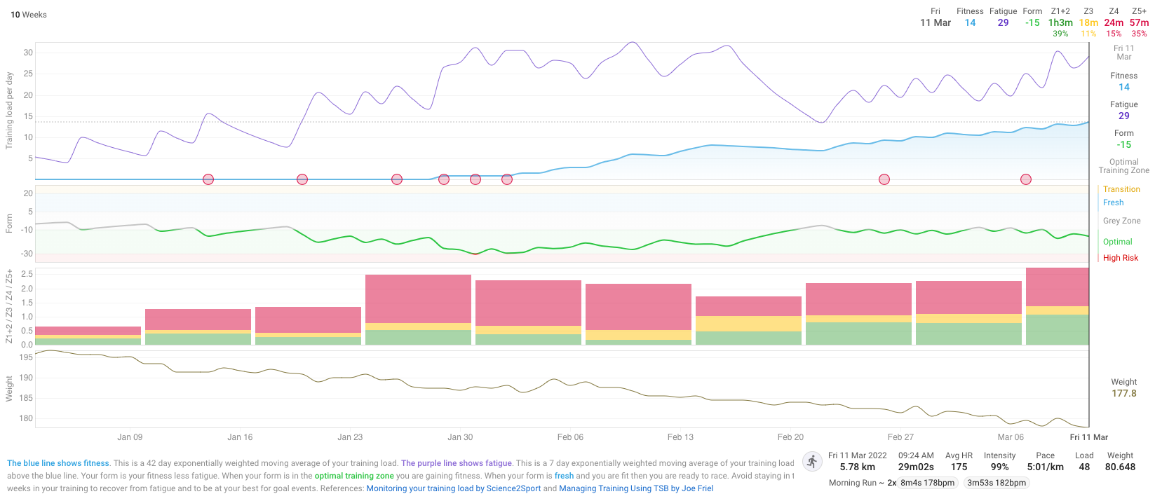
Example of an Analytic Dashboard.
3.2 Repository Dashboards
Common design patterns:
 Overflow page structure
 Tabbed page structures
 Data source
Data descriptions
Disclaimers
 Update information
 Visualizations
 Numbers
Navigation interactions
Many dashboards list a multitude of charts on a single website, with overflow page structures that make proper analytics difficult, i.e., making it more challenging to compare views. Their charts often lack textual or other narrative explanations, except for meta data information (which is often extensive). Charts may provide some interaction and usually provide links to explore, filter, and eventually download the raw data. Data and visualizations are updated, while choosing very common visualizations and numbers to visualize data. Extensive meta information is often provided for transparency and to support reuse. The images below show two examples of repository dashboard.
Repository Dashboard Examples
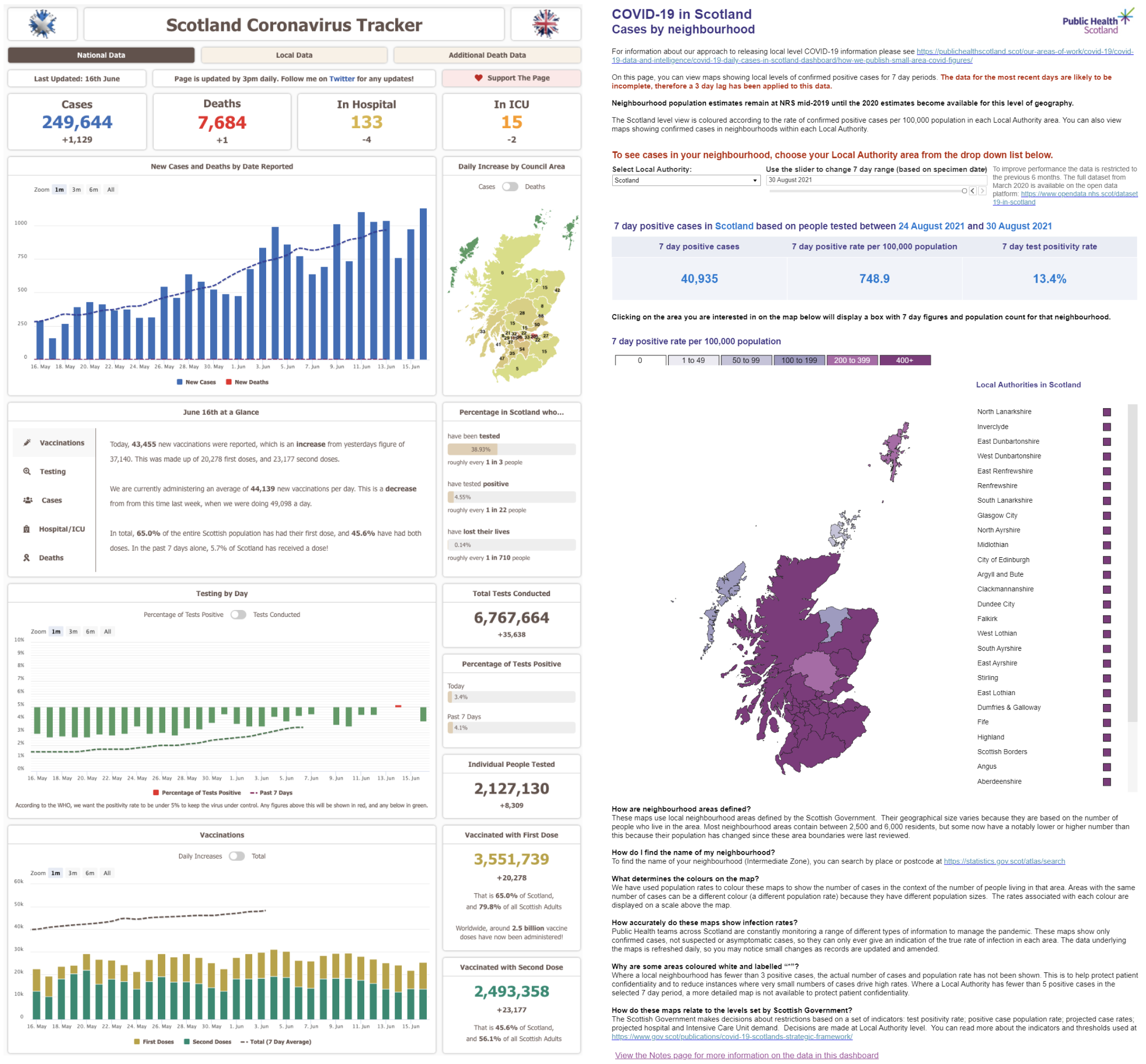
Two examples of a Repository Dashboard, which act like landing pages for large collections of data.
